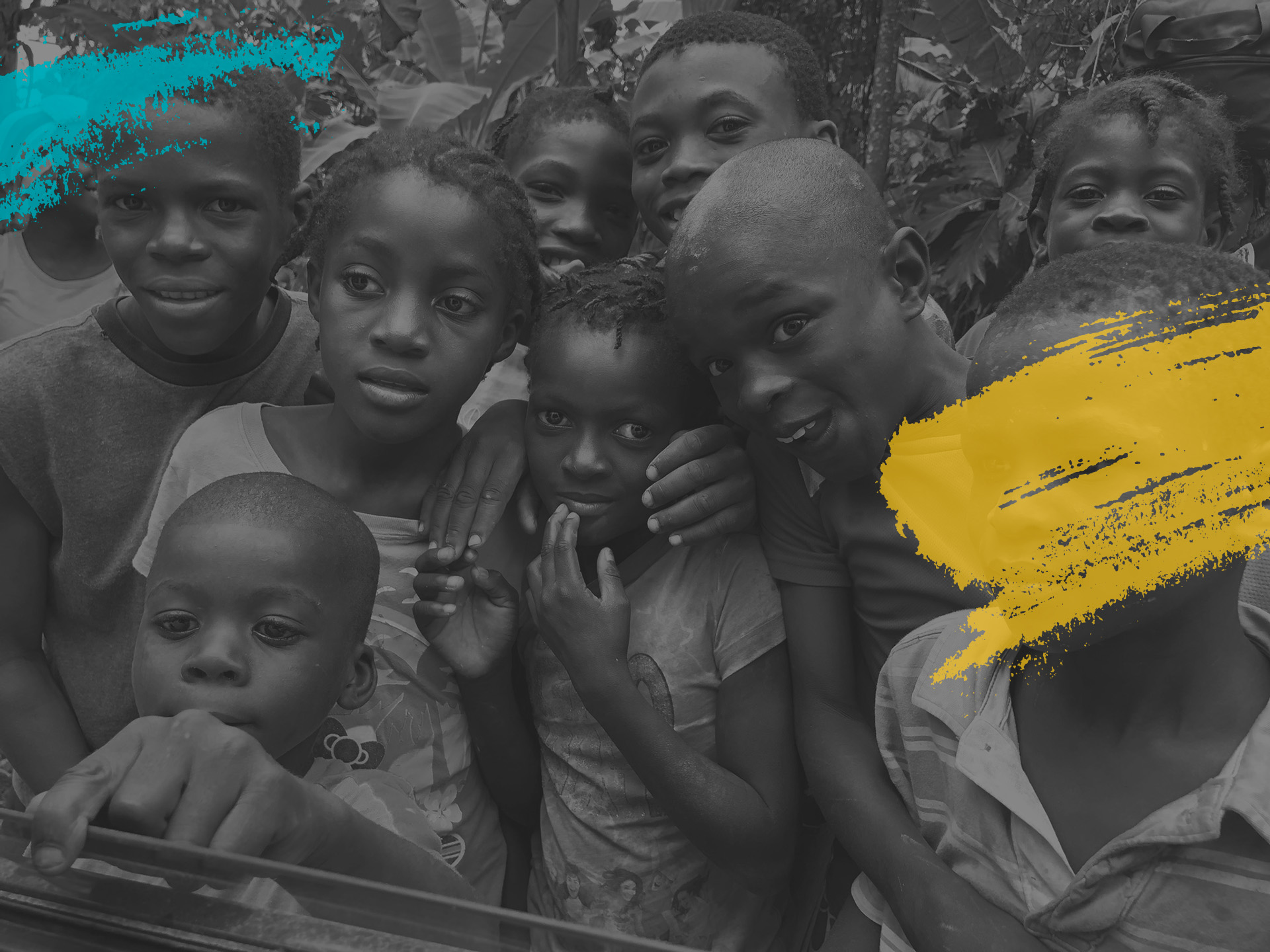
A Small Act
Can Change a Life
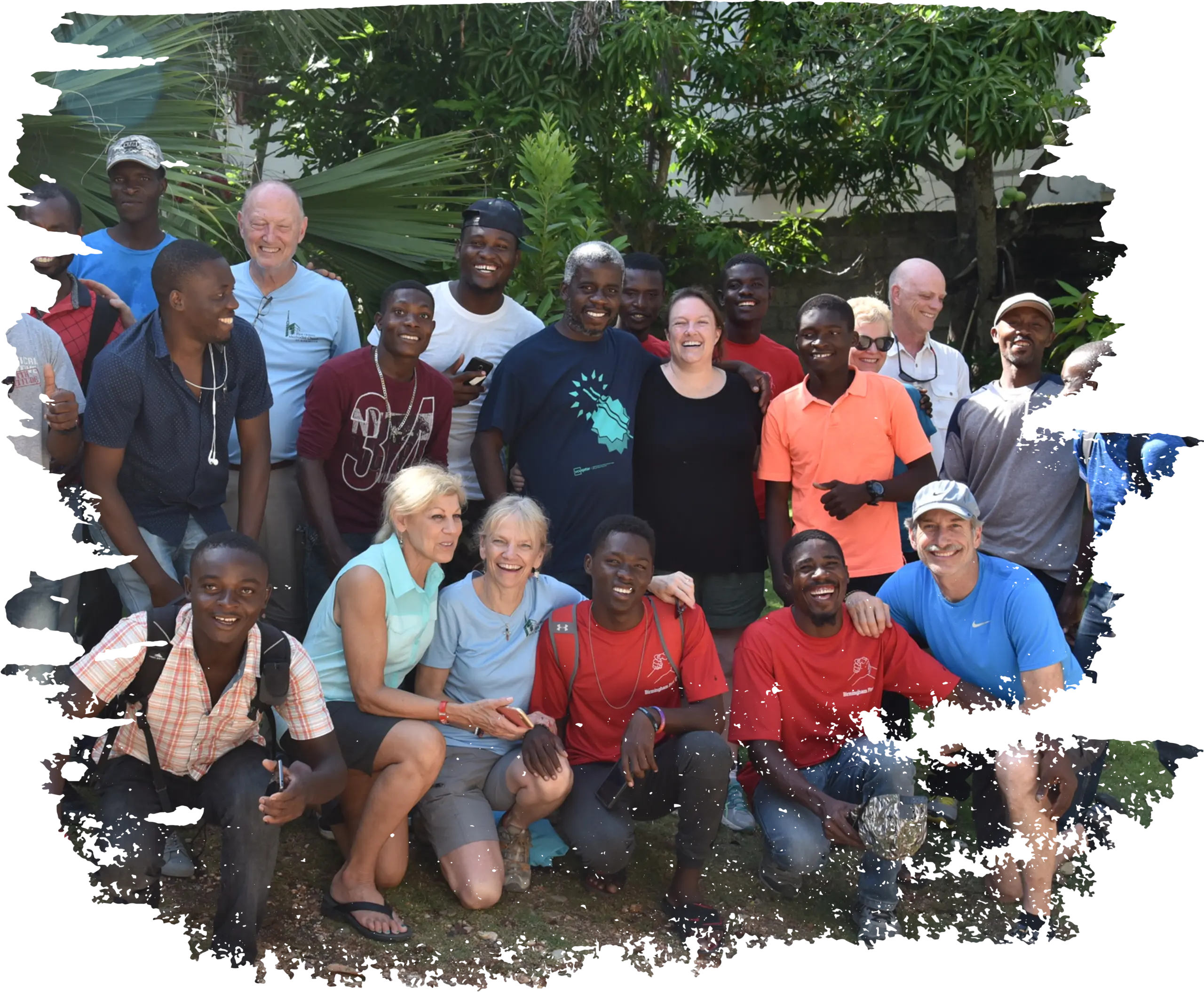
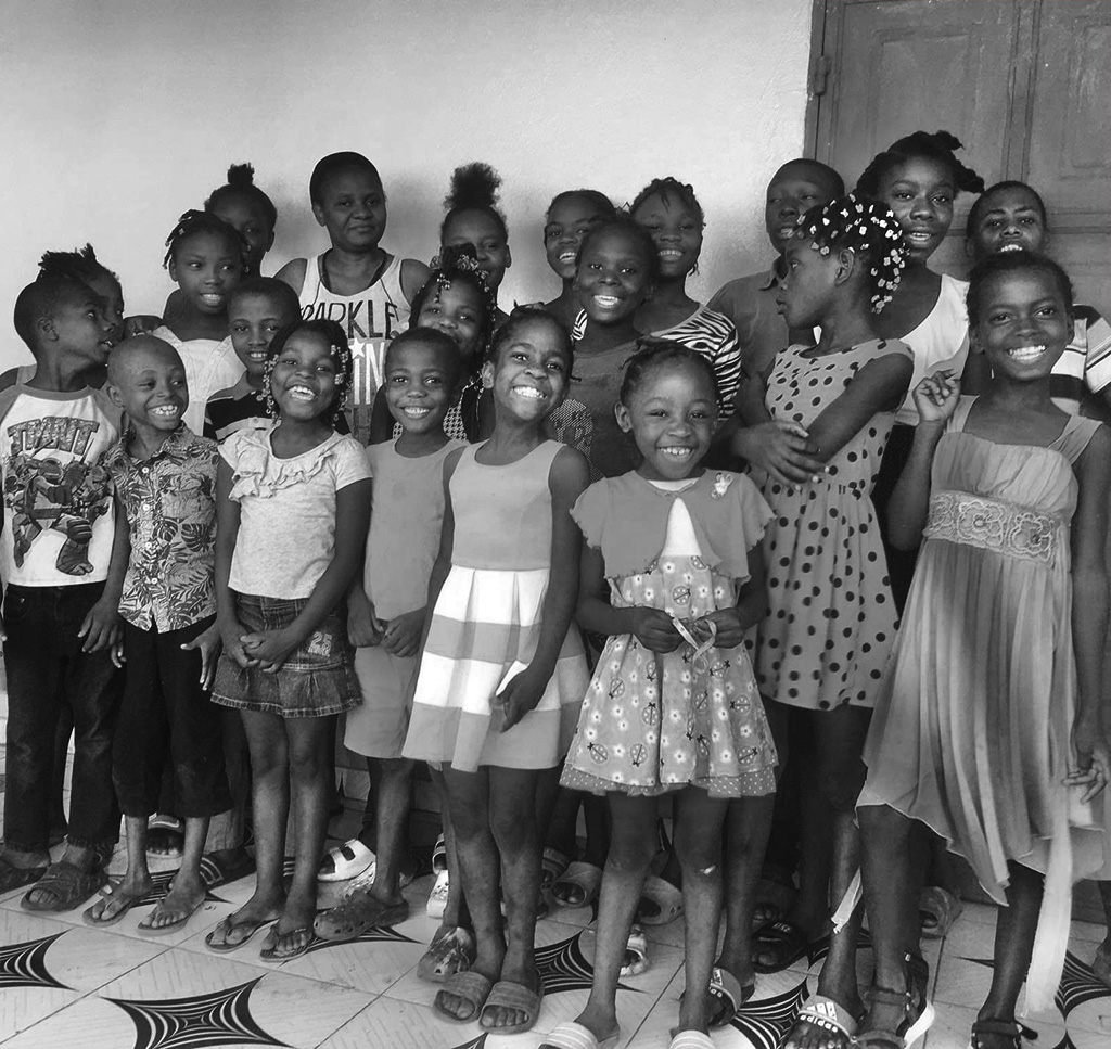
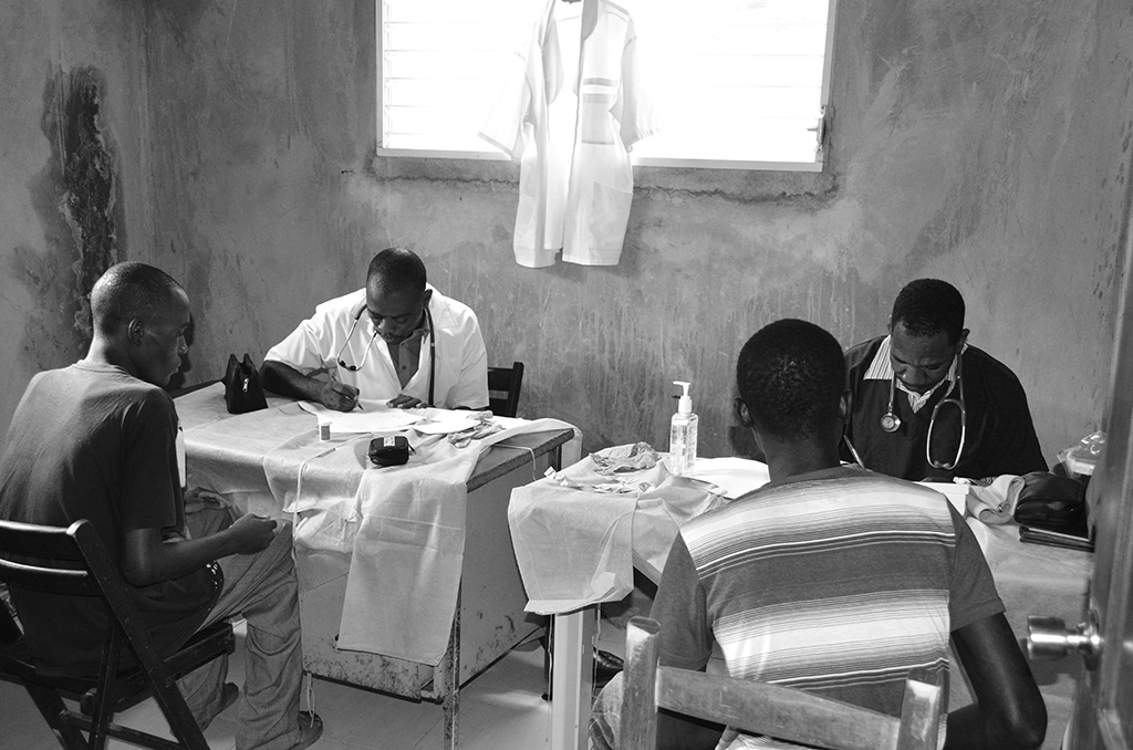
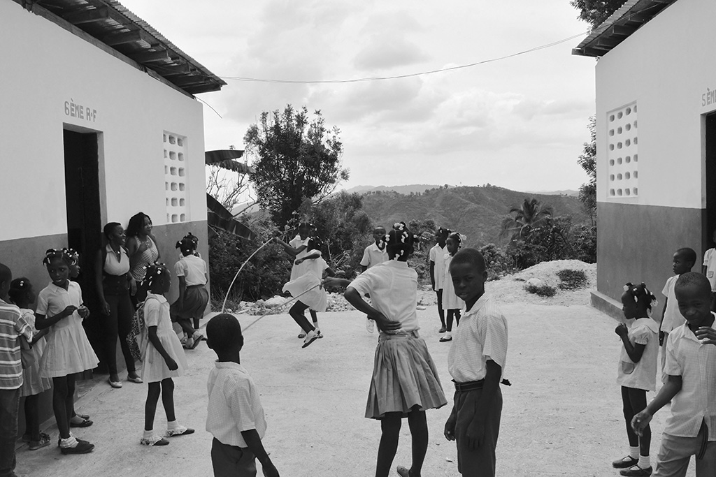
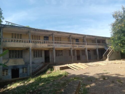
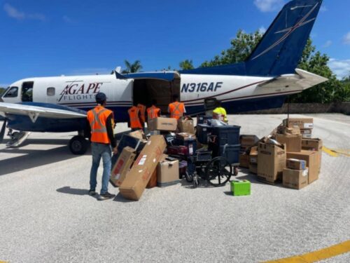
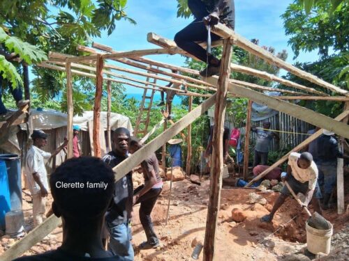
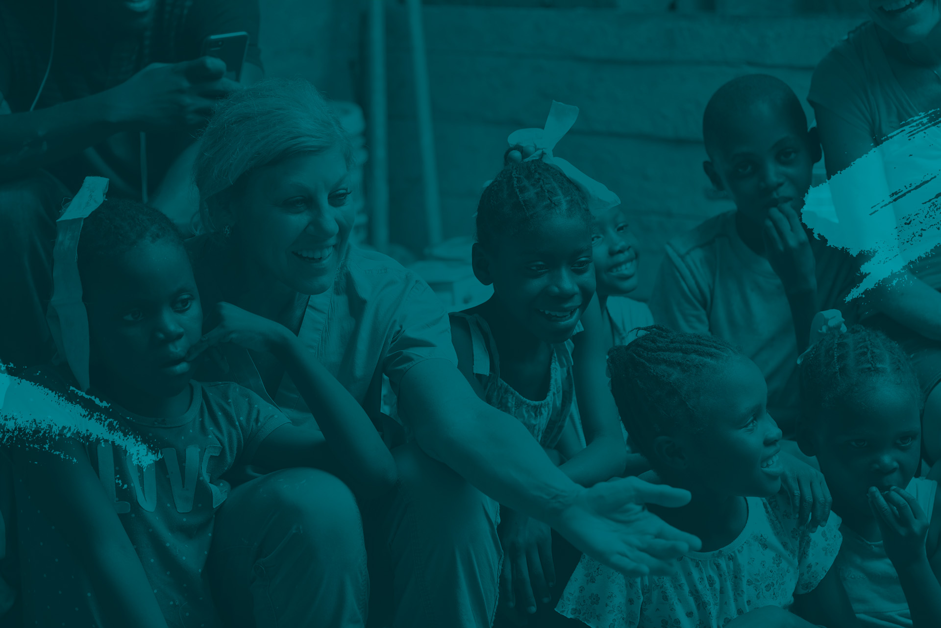
We’ve seen this thousands of times since our first visit to Jeremie, Haiti in 2011. Over the years, we’ve built a capable and trusted team on the ground, providing medical- educational- and shelter-related assistance to those in need of a helping hand. We’ve grown our outreach with each passing year and will touch more than 8000 lives in 2025. Help us do more.
Play Video
4:36